ZERO Y AXIS PREVENTS THE MISINTERPRETATION OF SMALL CHANGE
We now know that the average surface temperature of Earth is indeed around 15°C (59°F). NASA uses similar methods to determine the temperature of Earth and other planets in our solar system. This method primarily relies on measuring the infrared radiation emitted by a planet, which is directly related to its temperature. There was no reliable data to speak of before 1987 with more accurate data produced from satellites and most recent data at 15.20 C (59.35 F). The Bar graph below was published for the first and only time in 2020 during Bill Clinton’s term as president and drawn to indicate global warming since 1880.

.Key Advantages
- Honest Visual Representation: The primary advantage is ensuring that the visual representation of the data is honest and not misleading. With a zero baseline, the length or height of a bar (in a bar chart) directly corresponds to its actual value, preventing the exaggeration of differences.
- Accurate Proportional Comparison: Viewers can accurately compare the proportions and magnitudes of different data points. For instance, if one bar is twice the height of another, starting the y-axis at zero accurately reflects that its value is twice as large.
- Clear Context: Zero serves as a natural and intuitive reference point or benchmark for many types of data, such as counts, amounts, or frequencies, where zero means the absence of a quantity. This aligns with standard measurement and comprehension.
- Reduced Misinterpretation: By providing a clear and expected baseline, a zero y-axis helps prevent viewers from misinterpreting small changes as substantial, which can happen when an axis is truncated.
- Trustworthiness: Following this standard practice (especially for bar charts) builds trust in the chart creator and the data being presented, as it aligns with widely accepted data visualization best practices.
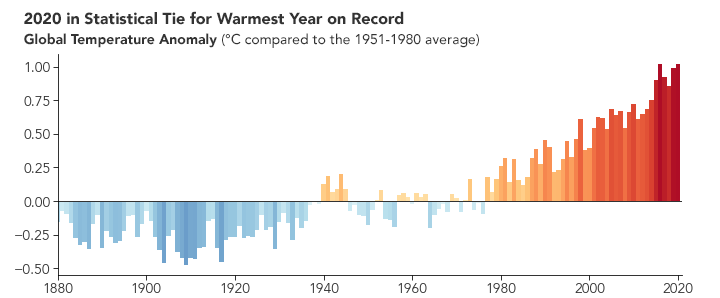
The chart above shows the same temperature as the above but is drawn with a broken Y axis giving the impression that global temperatures are climbing at a record rate. The above graph is a departure from reality and the use of gimmickry has done nothing to enhance their cause of increasing world temperatures.
13 Comments
This is so wrong. They are now using trickery when they know there has been very little change in the world temperature. The warming of the earth is just not happening.
With China, India, Russia and now US not coforming to the Net Zero what is the point of Australia, a small participent, ruining it’s economy by adhering to this madness.
This method primarily relies on measuring the infrared radiation emitted by a planet, which is directly related to its temperature. There seems to be a denial about our ability to measure earth temperature using this method or is it the fear that the net zero (trace gas emissions removal) might mean that it’s over for those who have hitched their careers to create a carbon dioxide drought..
There is no warming to be concerned about. They have dropped temperatures by lowering the baseline temperature from 15 C, which NASA had been using for more than 100 years, to 14 C without showing any apparent change to the lower graph. No need to change the anomalies and the graph still looks the same.
The Earth had already warmed to 15 C in 1915 and now realise that the earth remains at around 15 C (15.20 C) in 2025 after hitting 15.31 C in 2024. NASA had dropped 1915 to 14.06 C to pave the way for a warming of 1 C up to 15 C+ in 2024-5.
Once it was known that the earth’s temperature was a stable 15 C they dropped the baseline temperature from 15 C in 1994 to 14 C in 1995, allowing a warming back up to 15 C after 2024 and hovering around a maximum of 15.31 C the same temperature published by NASA in 1987, 1988 and slightly warmer in 1994 and then dropped to 14 C + in 1995 then warming back up to 15 C+ after 2024.
Understanding Global Warming of 1.5°C (2018)
Human activities are estimated to have caused approximately 1.0°C of global warming above pre-industrial levels, with a likely range of 0.8°C to 1.2°C. Global warming is likely to reach 1.5°C between 2030 and 2052 if it continues to increase at the current rate. (high confidence)
Warming from anthropogenic emissions from the pre-industrial period to the present will persist for centuries to millennia and will continue to cause further long-term changes in the climate system, such as sea level rise, with associated impacts (high confidence), but these emissions alone are unlikely to cause global warming of 1.5°C (medium confidence).
The IPCC are now announcing the annual average global temperatures relative to the pre-industrial temperature of 13.76 C. For example the actual average global temperature in 2025 was 15.20 C which was 1.44 C above the pre-industrial of 13.76 C. So instead of the rigmarole, the likelihood of disputes and requests for detail, they simply announce 2025 was 1.44 C !!
The 2024 WMO report that posted a temperature 15.31 C, 1.55 C above the pre-industrial temperature of 13.76 C, was slightly COOLER than the temperature recorded in 1987, yet the WMO has pegged 2024 as the warmest year on record and then falsely claim an extraordinary streak of record-breaking temperatures:
We all make mistakes and WMO are no different. They might have been right about there being a one degree of warming but wrong about the temperatures. What irks me is their reluctance to admit their mistakes and sink further into the mire by behaving like spoilt children and blaming everyone else for their blunders. There is a limit on what AI can do to bail them out.
The first time anything was said about the climate was in 1972 when President Nixon received a letter from George Kukla of Brown University warning that earth was cooling. An advisory committee was formed to monitor the climate and recommend measures to adjust and moderate the problem. A few years later they found there was no cooling but their were signs of warming. There was no temperature measuring to speak of before the Kukla letter and very little after except from ships that were restricted to there normal routes which meant there was very little data fron the southern hemisphere until satellites were employed in the late seventies. Global temperature records that go back to 1880 were the result of “modelling”.
US and Central England records that go that go back to before 1900, the most reliable of all, had shown no warming in the 20th century.. It is hard to find any authentic data records since global warming became and industry in recent years especially when it has been weaponised by the publicly funded WMO and !PCC.
The graph swells a bit in the late 1980’s when the IPCC, the Intergovernmental Panel on Climate Change, was established, what a coincidence!